It always amazes me the degree of impact we as lighting designers have on a space relative to the budget and volume of input say compared to the architect or M&E consultant. However, much like a sound engineer at a concert we have a significant role to play in the success of a space and how others interact with it.
Channels Design is a high-end furniture manufacturer with an artisanal approach to furniture making. Using mainly timber as his material of choice, founder Samuel Chan still makes his furniture feel contemporary whilst retaining the sense of heritage. He eschews the pursuit of trends for a rigorous and purist design process, which offers a timeless quality to the resulting pieces. This attitude means that Channels initiates trends and its influence can be recognised from the high street to high-end hospitality destinations.
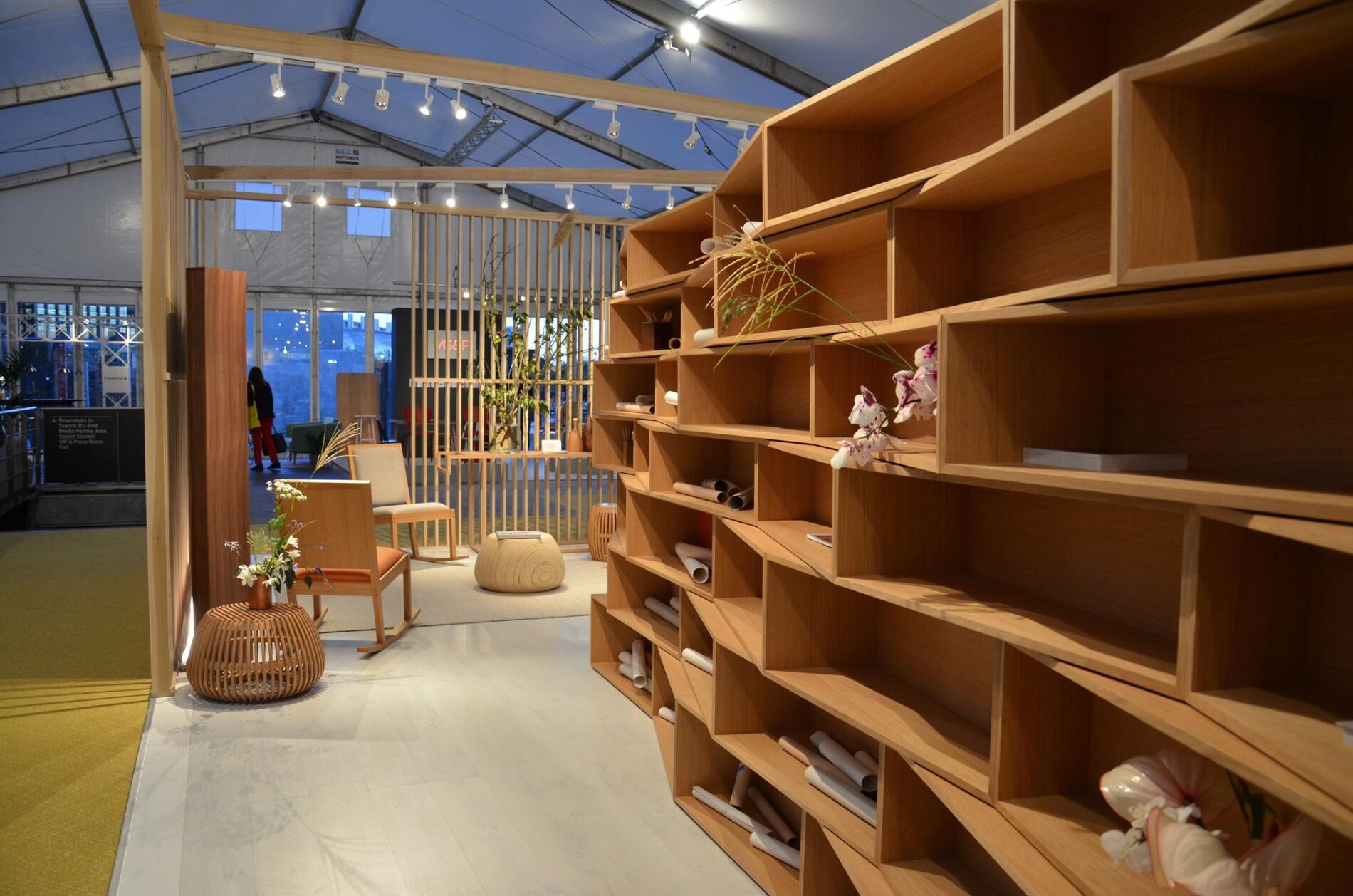
Channels approached Firefly to design the lighting of their stand at this year’s Design Junction which forms part of London Design Week. The brief was pretty open, but the final solution had to create a unique sense of identity in the usual exhibition setting with stands close to each other jostling for attention.
From the beginning of the design process, we recognised that the furniture itself would provide the defining element that would set the stand apart. It was important to have high CRI light sources that would highlight the grain in the timber and warmth of the tones. There was also an opportunity afforded by the slatted frame construction of the stand that would allow interesting shadows to be cast on the floor. As the organisers had imposed strict guidelines restricting the mounting of light fittings outside of the designated stand, we saw this technique as an opportunity to increase the apparent ‘footprint’ of the exhibition stand.
The key approach to creating a unique identity was to adopt a more residential feel to the space that would be soft and inviting. This would provide a natural setting for the furniture and create a non-threatening ambience to encourage visitors to breach the threshold and engage with the product and staff
Having investigated a few technical approaches with different light sources and luminaires we refined our brief for the actual hardware. It had to be discreet, simple, easy to install, and cost effective. We had initially looked at hiring lighting, but nothing on offer seemed to fulfil the brief in terms of light quality, aesthetics, ease of installation, and Budget.
This is where Soraa really came into its own and provided the perfect solution. The ethos of retrofit-ability in the sense that light quality, driver and optics were available in the lamp package alone, allowed us to propose a very basic and cost effective track solution whilst still achieving the lighting aesthetic we desired. For the final specification, we utilised the Soraa VIVID MR16-GU10 lamp featuring VP3 VIVID COLOR technology in a 2700K colour temperate mounted in a very low-cost track spotlight. This means the equipment can be re-used for future events, ensuring the lighting quality was retained.
When viewed against the surrounding stands the Channels stand was so vibrant and visually engaging that visitors to the show naturally gravitated towards it. We were pleased that our experience in lighting from one sector could be translated into a different sphere with such success.
The client’s response after the completion of the stand was surprise and delight: “The lighting is so soft, like a cloud of light. You‘ve actually created something beautiful.”


